
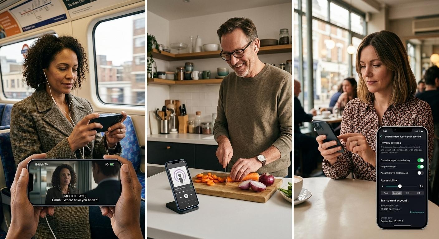
The smartphone has become the default starting point for a remarkable amount of British leisure time. It’s where many people choose a series for the train home, listen to a podcast while cooking, join a live quiz, read the news or browse an interactive service between errands. Entertainment no longer waits for a television set, games console or desktop computer. It fits into the gaps in the day.
That change has altered what users expect from digital platforms. A service that feels slow, cluttered or difficult to use on a small screen can lose people in moments. On the other hand, a well-made mobile experience can feel simple and dependable without being stripped of useful controls.
For UK publishers, technology firms and regulated operators, mobile-first is no longer a design preference. It is increasingly the basic standard against which a digital leisure service is judged.
Mobile use has turned into an everyday leisure habit
Streaming services helped set the pattern. People became used to stopping a programme on one device and resuming it elsewhere, receiving suggestions based on previous viewing, and finding content without leafing through a schedule. Music, sport, reading, social communities and interactive entertainment followed a similar route.
The key point is not that larger screens have disappeared. Far from it. Television remains central for shared viewing, while laptops still suit work, detailed research and longer sessions. Mobile has instead become the most immediate screen, the one already in a pocket or handbag when someone has a few minutes to spare.
That makes it valuable in several ways:
- It is always close at hand, removing the need to plan a session around a particular room or device.
- It supports short and long visits, from checking an update to settling down with a film.
- It is personal by nature, usually set up for one account, one set of preferences and one notification feed.
- It connects easily to other services, including digital wallets, calendars, messaging and accessibility settings.
- It offers continuity, allowing people to move between mobile, tablet, laptop and television.
This shift also explains why the old distinction between “mobile” and “digital” is becoming less useful. For plenty of users, the mobile version is the main version. A website designed for a wide monitor and squeezed onto a phone is unlikely to feel competitive beside an app or responsive browser service built around touch from the outset.
The broader story has implications for media coverage too. Technology, business and digital-lifestyle reporting increasingly meet at the same question: which platforms understand how people actually use their devices? The answer often lies in the smallest details, such as whether controls are reachable with one hand, whether captions are easy to switch on, or whether a page remembers where somebody left off.
Faster connections have raised the bar
Mobile-first entertainment depends on the underlying network feeling invisible. When video stalls, an account page refuses to load or a payment screen freezes, confidence can disappear quickly. The expansion of 4G and 5G coverage, alongside better home Wi-Fi and more capable handsets, has therefore changed expectations as much as it has changed technical possibilities.
Users increasingly assume that high-quality video, live updates and responsive interaction should work without much fuss. That does not mean every part of the UK enjoys identical coverage or that data allowances are irrelevant. Rural areas, busy transport routes and older devices can still produce uneven experiences. A sensible platform plans for those realities rather than designing only for ideal conditions.
Responsive design is a large part of that planning. A good mobile interface is not merely a smaller desktop page. It considers thumb reach, readable text, portrait and landscape use, loading times and the fact that a user may be interrupted at any moment. Clear navigation matters more on a phone because there is simply less room for confusion.
Personalisation is another differentiator, though it needs restraint. Useful recommendations can save time and help users find material that suits their interests. Excessive prompts, opaque rankings and relentless notifications can make a service feel intrusive. The better approach is to provide meaningful choice: let users adjust notification settings, amend preferences and understand why particular content is appearing.
Cross-device continuity is now part of the same expectation. Someone might start listening on a phone, continue through a smart speaker and later pick up the same programme on a tablet. Account systems need to make that handover straightforward while respecting security. It sounds ordinary, but it is precisely this sort of quiet reliability that separates a polished service from an irritating one.
Accessibility belongs in the conversation as well. Captions, scalable type, contrast options, screen-reader compatibility and straightforward controls improve the experience for many people, not only those with a declared accessibility need. Mobile design has a tendency to reward simplicity, and that can be a genuine advantage when it is handled thoughtfully.
Payment should feel clear, not invisible
As more leisure services involve subscriptions, one-off purchases or account deposits, payments have become part of the product experience. Nobody wants to decode a complicated checkout screen on a small display.
The strongest platforms make the process clear at each stage. They show the amount, explain recurring charges where relevant, offer recognised payment methods and provide an obvious route to receipts, account history and cancellation information. A frictionless journey should not mean a vague one.
Trust is built through practical signals:
- Secure sign-in and account recovery that do not leave users stranded.
- Straightforward pricing, with terms presented before a transaction is confirmed.
- Appropriate identity checks, especially where age or legal eligibility matters.
- Visible support channels for questions, disputes and technical problems.
- Controls that are easy to find, rather than buried in a long settings menu.
Identity verification can add a moment of inconvenience, but it often has a legitimate purpose. In regulated categories, it can help establish that a customer is entitled to use the service and support efforts to prevent fraud. The design challenge is to explain why information is requested, collect only what is necessary and protect it properly.
British consumers are also more alert to privacy than they once were. They may accept a degree of personalisation, particularly when it improves relevance, but they expect organisations to handle data responsibly. The UK GDPR, overseen by the Information Commissioner’s Office, sets an important baseline. Clear privacy notices and meaningful choices are not decorative legal extras. They are part of a platform’s credibility.
Regulation is shaping the design, not sitting beside it
Not every form of digital entertainment is governed in the same way. A streaming platform, a ticketing app, a social community and a regulated gaming service face different rules and risks. Yet the direction of travel is similar: providers are expected to think more carefully about access, transparency, privacy and user welfare.
Age assurance is a good example. Services hosting adult material or offering age-restricted activities need measures that are proportionate to the content and the potential harm. A simple declaration of age may not always be enough. At the same time, checks should be designed with data minimisation and security in mind. Collecting unnecessary personal information is not a sensible substitute for a considered verification process.
For licensed gambling operators, the UK Gambling Commission sets requirements that go beyond basic account creation. Customer identity, anti-money-laundering checks, fair presentation of information and customer-interaction arrangements all influence how a platform should operate. The detail may be technical, but the principle is easy to understand: an adult should be able to see what they are doing, set limits where available and obtain help without hunting through the site.
Player-protection tools are particularly important in this area. Depending on the service, these can include deposit limits, time reminders, account history, cooling-off options and self-exclusion routes. They should be presented clearly and work properly on mobile. A control that is difficult to locate on a handset is not much of a control at all.
There is a useful wider lesson here for the entire entertainment sector. Safety features work best when they are part of the product from the beginning, rather than added after a launch. That includes plain-language terms, sensible notification settings, transparent recommendation systems and customer support that recognises mobile users may need answers quickly.
A regulated category within the wider market
Mobile entertainment is a broad market, ranging from on-demand television to interactive communities and paid digital services. Within it sit tightly regulated, age-gated categories that require a higher level of care around verified access, payments and user controls.
For UK adults comparing platform experiences, Virgin Games’ online slots are one such category alongside the wider mobile-entertainment market. The relevant design questions are not about spectacle. They are whether access is properly restricted to adults, whether identity and payment checks are handled securely, whether key account information is understandable on a phone, and whether player-protection tools are visible and usable.
That distinction matters. Convenience has helped make mobile the front door to digital leisure, but trust will decide which services remain welcome there. The strongest platforms will be those that combine quick, responsive technology with clarity, privacy and responsible design.