
Audio Visual diagrams are an excellent way to convey complex audio visual system diagrams, designs, and configurations in a simple, easy-to-understand format. However, there are some common mistakes that designers often make, which can negatively impact the clarity, usability, and effectiveness of these diagrams. As an audio visual system designer or engineer, it’s important to be aware of these pitfalls so you can produce diagrams that are optimized for the end user.
In this blog post, we will discuss 11 of the most common mistakes made when designing audiovisual diagrams and provide tips on how to avoid them. The goal is to help you create diagrams that are easy to follow, clearly convey the necessary information, and meet the needs of your viewers or clients. Following best practices can make a big difference in whether the person reviewing your audio visual diagram can comprehend and utilize it as intended.
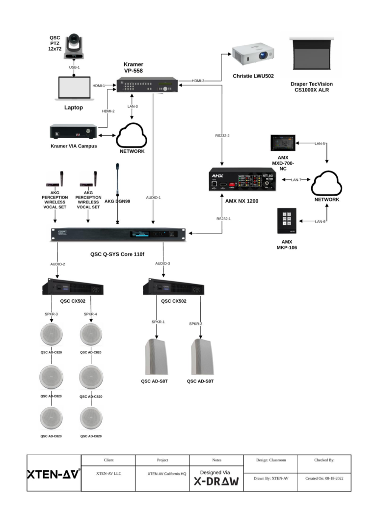
Mistake #1: Not including a title or missing component labels in your audio visual diagram
One of the most basic mistakes people do in their audio visual diagram is failing to clearly indicate what a diagram is showing through a descriptive title. The diagram should also have all major components clearly labeled so it’s obvious what each piece represents at a glance. Without labels, viewers have to try and infer what different shapes or lines signify – adding unnecessary complexity.
Some tips to avoid this mistake:
- Always include a clear, concise title at the top indicating the system or scenario portrayed
- Label all major equipment, cables, connections, and spaces using consistent terms
- Consider adding a legend for non-standard symbols
Taking these small steps ensures anyone glancing at the cable management diagram instantly understands its purpose and key elements without extra decoding work.
Mistake #2: Overly complex or crowded layout in the audio visual diagram
It’s easy to get caught up in including every minute detail when designing an audio visual system diagram. However, an overabundance of information can make the diagram difficult to navigate visually, and busy or convoluted layouts slow comprehension.
Here are tips to avoid an overly complex layout:
- only include details relevant to understanding the core concepts
- opt for simplicity over completeness initially
- use spacing, color, or shapes to group related items visually
- consider breaking a complex system into multiple simpler diagrams
- focus on one perspective or scenario at a time
Simplifying the visual information presented makes it easier for viewers to focus on the important parts without getting lost in the weeds.
Mistake #3: Inconsistent or non-standard symbols
Using symbols, icons, arrows, and lines in a consistent, recognizable fashion is important for comprehension. However, designers sometimes get creative and experiment with new or ambiguous symbols. While variety can be nice, it introduces complexity that works against clarity.
Tips for consistent symbols:
- stick to common/standard diagramming symbols when possible
- define any custom symbols through a key or legend
- maintain symbol meanings throughout related diagrams
- use shape, line type, and color purposefully and consistently
Standardization lets the viewer concentrate on relationships rather than interpret unfamiliar graphic elements. However, custom elements should still be clearly defined in the audio visual diagram.
Mistake #4: Poor flow or ineffective organization
The way information flows visually through a diagram greatly impacts its ease of follow-up. Common issues include irrelevant detours, a lack of logical flow, missing connections, or poor hierarchy.
Ideas to improve flow and organization:
- use proximity and positioning to depict relationships
- introduce concepts from general to specific
- utilize connectors to clearly show signal pathways
- employ ranking, grouping, or numbering for order/priority
- consider flow charts for process-related diagrams
Taking the time to thoughtfully structure the layout prevents overload and helps ensure core concepts are conveyed smoothly in the audio visual diagram.
Mistake #5: Insufficient labeling of ports and connectors in the audio visual diagram
When displaying how devices connect in an audio visual system, it’s important to properly label ports and connectors so their function and purpose are clear. Leaving these unlabeled breeds confusion.
Tips for connector labeling:
- use consistent text near each port/jack indicating its type
- consider shape coding ports by type for quick identification
- confirm labeling matches relevant documentation
- include port numbering schemes for complex setups
Clear labeling lets viewers understand where inputs/outputs integrate without guesswork. It’s a small detail that makes a big difference.
Mistake #6: Uncalibrated or inconsistent scales
Diagrams showing floorplans, cable lengths, or physical dimensions can easily become misleading if the scale is incorrect, undefined, or applied unevenly.
To avoid scale issues:
- define the scale ratio prominently (e.g., 1cm = 1m)
- use a consistent, relevant scale throughout
- Double-check measurements against documentation
- only scale elements meaningful at that ratio
- consider isometric views for dimensional accuracy
Using calibrated scales maintains the diagram’s integrity and prevents interpretations based on deceptive or undefined proportions.
Mistake #7: Poor print format or readability
While online or digital versions see the bulk of use today, printed diagrams remain common. But printing introduces new challenges if readability isn’t considered from the start.
Ideas to improve print-friendliness:
- use large, clear typefaces optimized for print
- avoid unnecessary fine detail or hairline objects
- reduce crowding by tiling multipage if needed
- incorporate consistent sheet sizes for binding
- accommodate planned reproduction/reduction
Accounting for real-world usage, like printing, helps diagrams stay useful in all contexts.
Mistake #8: Lack of revision history
In complex, evolving systems, diagrams can easily become outdated over time. Without context, viewers can’t discern the evolution or intended scope.
Some ideas to address this:
- include revision dates and brief notes on changes
- consider version numbering major updates
- archive online access to previous iterations
- highlight components in scope versus outdated data
Keeping diagrams versioned and change-managed maintains their audio visual integration like snapshots over the long run. Context helps navigation remain relevant.
Mistake #9: Poor document usability & handling
While visual execution deserves focus, the overall usability of AV diagram template impacts its effectiveness. Formats matter, too.
Ideas to improve usability include:
- providing clear folding/assembly instructions
- optimizing file formats for different contexts/devices
- including indexing, pagination for reference
- enabling markup comment capability in digital docs
- using durable materials suited to conditions
Usability considerations like these ensure diagrams stay useful working tools rather than one-off renderings.
Mistake #10: No explanation of assumptions or context
Audio visual diagrams often depict just a snapshot devoid of surrounding assumptions, variables, or influencing factors. If full project parameters aren’t understood, this can lead to misinterpretation.
Some ways to address this:
- include relevant background details in notes
- callout scope limitations and unknowns
- assume varying levels of viewer experience/knowledge
- reference related documents providing fuller context
- describe how the diagram fits within the larger system
Supplying context helps avoid misunderstandings based on readers lacking complete project awareness.
Mistake #11: Overly optimistic timelines
While time commitments are often outside a designer’s control, unrealistic deadlines proposed can lead to quality issues. Rushing breeds mistakes.
When providing estimates:
- reference past experience with similar scopes
- account for design, approval, and revision cycles
- incorporate necessary testing and validation steps
- allow contingency for unforeseen variables or changes
- communicate known timeline risks transparently
Being realistic helps set appropriate client expectations and reduces rushing that comprises a diagram’s usefulness down the road.
Conclusion
Designing effective audio visual diagrams requires balancing many considerations, from visualization to documentation. While individual styles will always vary, following the general best practices outlined here can help avoid many common pitfalls. Above all else, the goal should be clear communication tailored to end-user needs.
With practice and experience, these tips can be applied intuitively to produce diagrams that will serve their purpose well in the future. Never hesitate to audit past work critically—each improvement makes the next generation better. Continuous learning ensures diagrams remain a valuable tool for understanding complex technical systems visually.
What Audio Visual Diagram software would you recommend for designing AV diagrams?
There are several options for software to create professional-quality AV diagrams:
- X-DRAW is a good audio visual diagram software that works on cloud storage and is a one-stop solution for all AV design and diagram requirements, such as AV schematic diagrams and basic AV diagrams.
- Visio is a popular choice for its built-in shapes, AV diagram templates, and connectivity drawing tools geared towards this purpose. It works across Windows, Mac, and web.
- AutoCAD is the standard for technical/engineering drawings but has a steeper learning curve. Useful when precise dimensions are needed.
- OmniGraffle is Mac-focused but offers great drawing flexibility and organizational features for drawings such as AV wiring diagrams, single line diagrams, and more.
- io is a free online/downloadable diagramming tool with hundreds of predefined shapes. Cross-platform compatibility.
- Lucidchart is a full-featured web/cloud-based alternative to Visio popular for collaboration. 30-day free trial available.
- Inkscape is an open-source vector graphics editor good for custom symbol/icon creation. Steeper learning curve.
Any of these can produce clear, effective AV diagrams. Visio or Draw.io are the best initial options as they are easy to use and have built-in toolsets.
How do I use AV diagrams for different audiences, such as clients vs technicians?
It is important to consider your target audience when designing AV diagrams so that you have clarity for their specific needs. Here are some tips:
- Focus on contents that are descriptive and include big-picture context and flow instead of just displaying the technical information.
- Don’t choose diagrams that just display technical content. Instead, use diagrams that showcase functions, experiences, and outcomes.
- Use generic symbols and emojis that have minimum technical terms. The idea is to create generic content that dont require expert knowledge of the same.
- Include overviews that are understandable by technicians along with diagrams or layouts of specific components for better understanding.
Make sure you clearly state the target audience for each of your graphs or designs to prevent confusion through the audio visual diagrams.


