
You’ve spent hours planning your presentation, finding the perfect images to illustrate your points, and creating perfectly formatted slides. You’re confident you have an excellent presentation in your hands. But there’s one thing left to do: what color should you make it?
The colors you choose for your presentations can help convey moods or feelings, attract attention, reinforce essential ideas, and more. Choosing the right colors is necessary if you want people to pay attention to all of the hard work to make this presentation!
All the work of picking the right templates won’t be important if the colour is wrong.
However, choosing color palettes for your presentation can be a daunting task. There are so many shades to choose from, and not every shade will work with your content or make it easier for the audience to follow along. That is why we will let you know the attractive color palette that you can use in your presentations to increase engagement and retention of your information.
But first, let us learn about color theory!
A gist of color theory
To create an effective presentation, you need to understand the basics of color theory. It includes information about how colors work together and how to use different colors to produce specific effects. By understanding color theory, you can create visually appealing and memorable presentations.
There are three parts included in color theory:
- Monochromatic: It includes only one hue (color) but has many variations including tints and shades.
- Complementary colors: They contrast with each other to create balance in an image or design.
- Analogous colors: It has varying degrees of difference from one another on the color wheel.
A designer must always be aware of these concepts when deciding which colors to use for their visual marketing campaign or other presentation topics. They will directly affect the message and the overall aesthetics of said product or service.
8 color palette ideas
Dull colors make presentations boring. Whether you’re just starting with presentations or you’re looking for ways to improve your current slides, the following are some best color palette ideas for your next presentation.
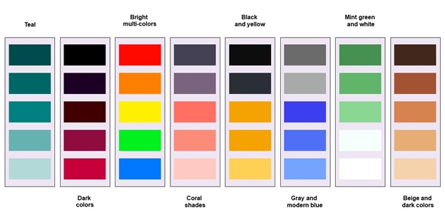
- Teal
Teal makes everything in your presentation soothing. It is a powerful color effect that can stand out alone and give your presentation a compelling look. If you pair this color palette with black or white images, your content will become even more eye-catching.
- Dark colors
It is the trendiest color scheme ever. Dark mode colors have their visual appeal, which means you don’t need to add images or other icons to make your presentation unique. It will be good for you and your audience if you deliver creative presentations infused with dark colors.
- Bright multi-colors
A great way to find the perfect color palette for your presentation is to use a mix of bright, multi-colored backgrounds and fonts. It will not only keep your audience engaged but also help them remember the information you shared.
- Coral shades
Consider using a coral color palette to create a bright, vibrant, and engaging presentation. Bright coral is an eye-catching color that can help convey a positive and energetic message. Not only will your audience be drawn to your brightly-colored slides, but they’ll also be more engaged and attentive.
- Black and yellow
Using a blue and yellow color palette in presentation design can never go wrong. The use of these colors is proven to increase the retention level of content and engagement. It can also be used strategically among different sections of your slides so that they flow together seamlessly.
- Gray and modern blue
Gray and modern blue are two great choices that can add a touch of sophistication to your slides. They are both neutral colors that don’t distract from the content being presented on the slide. So choose this versatile color palette and create an impactful presentation.
- Mint green and white
The importance of mint green and white color palette in presentation design is that it makes the presenter look confident, intelligent, and authoritative. The colors are also soothing to the eye, which can help keep an audience alert during a presentation.
- Beige and dark colors
Mint beige (a light gray) and dark colors are an effective combination for presentations because they offer contrast, depth perception, high visibility in dimly lit rooms, energy efficiency, and reading ease with small fonts and large slides. So you can opt for this attractive color palette to supercharge any meeting or conference.
Conclusions
Use these beautiful color palette ideas to create stunning presentations and raise your audience’s interest! If you want to grab templates for your presentations with appealing designs and aesthetic colors, visit SlideTeam, the world’s largest online collection of 2 million+ pre-designed and fully editable templates that you can easily download and deploy. The company’s professionals have designed layouts with utmost care and dedication. So you can choose engaging templates from their website that match your business needs.


